
Data doesn’t have to be boring. But when you’re thinking about how to present that data, it can be hard figuring out where to begin. To help inspire you, we’ve compiled a list of six of our favourite data visualisation examples.
Gender pay gap: what we learned and how to fix it
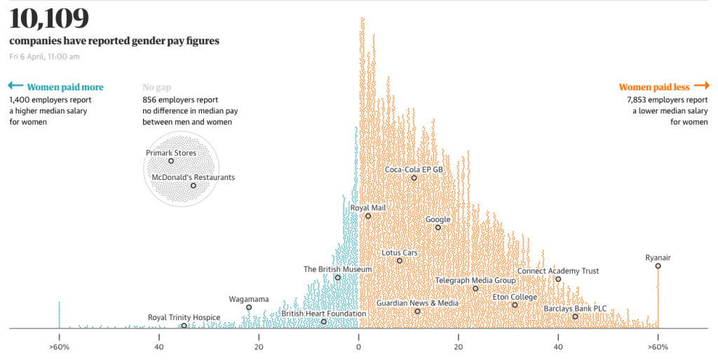
Introducing movement is an easy way to elevate graphs from mediocre to mesmerizing. In this example, the Guardian demonstrates just how easily that can be done with some very simple animation. As you scroll down the page, each graph begins to fill itself in. This makes you stop to fully digest what each graph is telling you—whereas you may have scrolled past a static equivalent.
US Thanksgiving on Google Flights
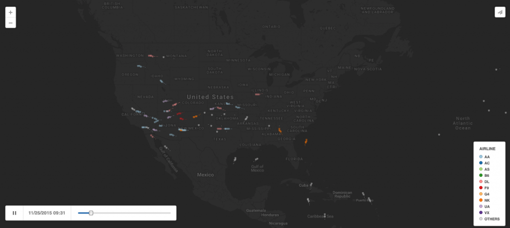
You may think that a graph about flight patterns would be boring, but introduce movement and it becomes a whole different ball game—as this example shows. The only downside is that the data you can view is limited—once the clip is over it begins again offering no options to further explore the data set. But as an animated visualisation it’s perfect for showing the popularity of flight times.
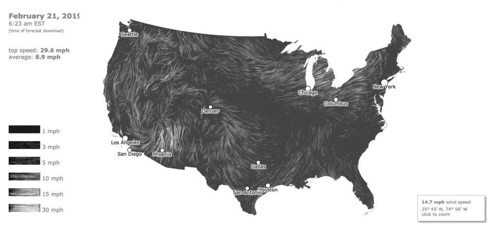
Rather than just stating the wind speed for various different locations across the US, this shows you them in context—and that makes it easier to understand and digest. Not only are you able to see the movement of data clearly, you’re also able to interact with the data and click into the map for more information on certain areas.
What’s really warming the world?
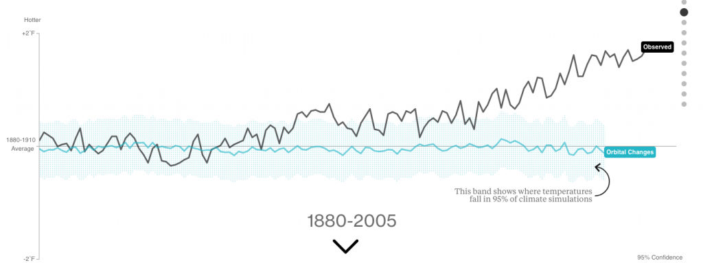
You don’t want your readers to be overloaded with data, so it’s important that you split it into digestible chunks. That’s what makes this example from Bloomberg so effective. It takes each of the elements that impact global warming, like volcanoes and aerosol pollution, and plots them onto individual charts. Breaking them down in this way allows you to examine each factor in turn and its specific impact on global warming. At the end, all of that information is compiled into one chart showing their combined impact on global warming. And because you can click into the chart to add or remove data, you can see how each factor relates to the others, as well as the overall picture.
You draw it: What got better or worse during Obama’s presidency
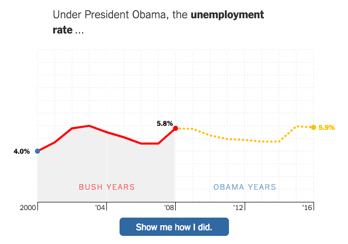
An effective way of getting readers to think about your data is by asking them to interact with it in some way. In this example, you’re asked to compare the years under Bush’s presidency with those of Obama. You’re presented with the data, say the unemployment rate, for the Bush years, and are asked to fill in the rest of the graph. This makes you think about the question, what it means, what the graph is already showing you and what the answer could realistically be—how did the unemployment rate change during the Obama years? This helps you absorb the information better than if you’d just been presented with the results.
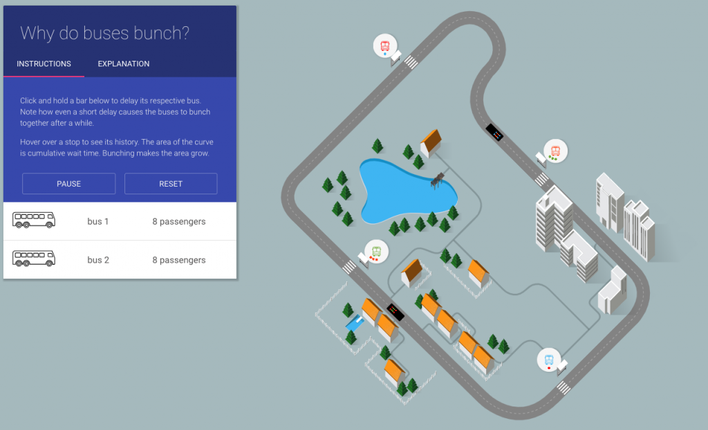
This example shows how a complex concept can be explained better through interactivity. This data could have been displayed in a chart or a table, but it would have been very difficult to understand—and wouldn’t have been nearly as engaging. Instead, the data has been gamified and the power has been put into your hands. You control the buses and you control the amount of time they stop for. Every second you delay a bus at the bus stop or at a crossing increases the likelihood that your buses will end up bunched. You’re more likely to remember the results of this data because you’re the one making them happen.
These examples offer a great starting point for thinking about how to visualise your data. Knowing your data and the narrative you are trying to tell will help you determine whether animation or interactivity is appropriate, and which one will work best. But be careful that any animation or interactivity you do add doesn’t confuse the end user and detract from the story you’re trying to tell.
There’s no point in style over substance, but there’s also no reason data shouldn’t be interesting.
Posted by John on 14 March 2019