
Not the real thing, like that created by McCandless and Rosling, but lots of the stuff knocked together by marketing people and inaccurately labelled an infographic.
1. Icons do not an infographic make
Putting a percentage in really big letters or sticking a brightly coloured icon or two next to it does not make something an infographic. By definition an infographic should help the reader to understand the information better. I don’t need a little picture of a car to remind me what one is, but I do need help to put enormous numbers and complicated relationships into context.
Simple can be very powerful
The Billion Dollar Gram is justifiably one of the most famous infographics ever. The design is incredibly simple, but it gives context to the massive numbers of the US federal budget and the bank bail out.
2. ‘Amazing’ stats should be treated with care
We all want to create that ‘wow’ moment. The stat that’s so good it makes the reader want to share it, and then go and buy whatever it is that we’re selling—product, service or policy.
But in the quest for an ever more startling fact, accuracy and meaning can suffer. In a lot of cases that probably doesn’t matter. Most infographics have a shelf-life less than that of a prawn sandwich. But if your infographic goes viral or is picked up by the media, then it could be very embarrassing to have your figures questioned or even ridiculed.
99% of gun shops in the US are within 5 miles of a school

Shocking. Or is it? The US has more than 100,000 schools. If you drew a 5-mile circle around each, the total area of all the circles would be 7.9 million sq miles. The total area of the US is just 3.8 million sq miles, so it’s fair to assume that even if the schools were randomly distributed those 100,000 circles would cover most of the country. But of course schools aren’t randomly located, they are built where there are people. And guess what else are built near people? Shops.
3. Numbers are like words—more isn’t necessarily better
For pity’s sake people, edit. Infographics are no different to any other document. Pick a story and tell it to me clearly. Don’t just dump a load of stats in my lap and assume that because you’ve ticked the “published infographic” box on your list of objectives that I’ll miraculously be more likely to buy your product.
Statistics aren’t a substitute for a compelling story
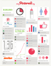
This infographic on Pinterest is a veritable masterclass on how not to do it. Annual income is $100k+, average I assume. Worldwide? That seems hard to believe. Pink and blue icons for gender, same size despite the site having twice as many female users as male. An age column chart with three different sizes of band. And I don’t even know where to start with the 1.36 pictogram, it’s so wrong. But more than anything, what the hell is it trying to tell me?
The hyper-popularity of infographics will probably wane fairly soon, but they’ll no doubt linger on for quite a while. Let’s do everybody a favour and make the infographics that we produce accurate and informative.
Posted by John on 5 April 2013